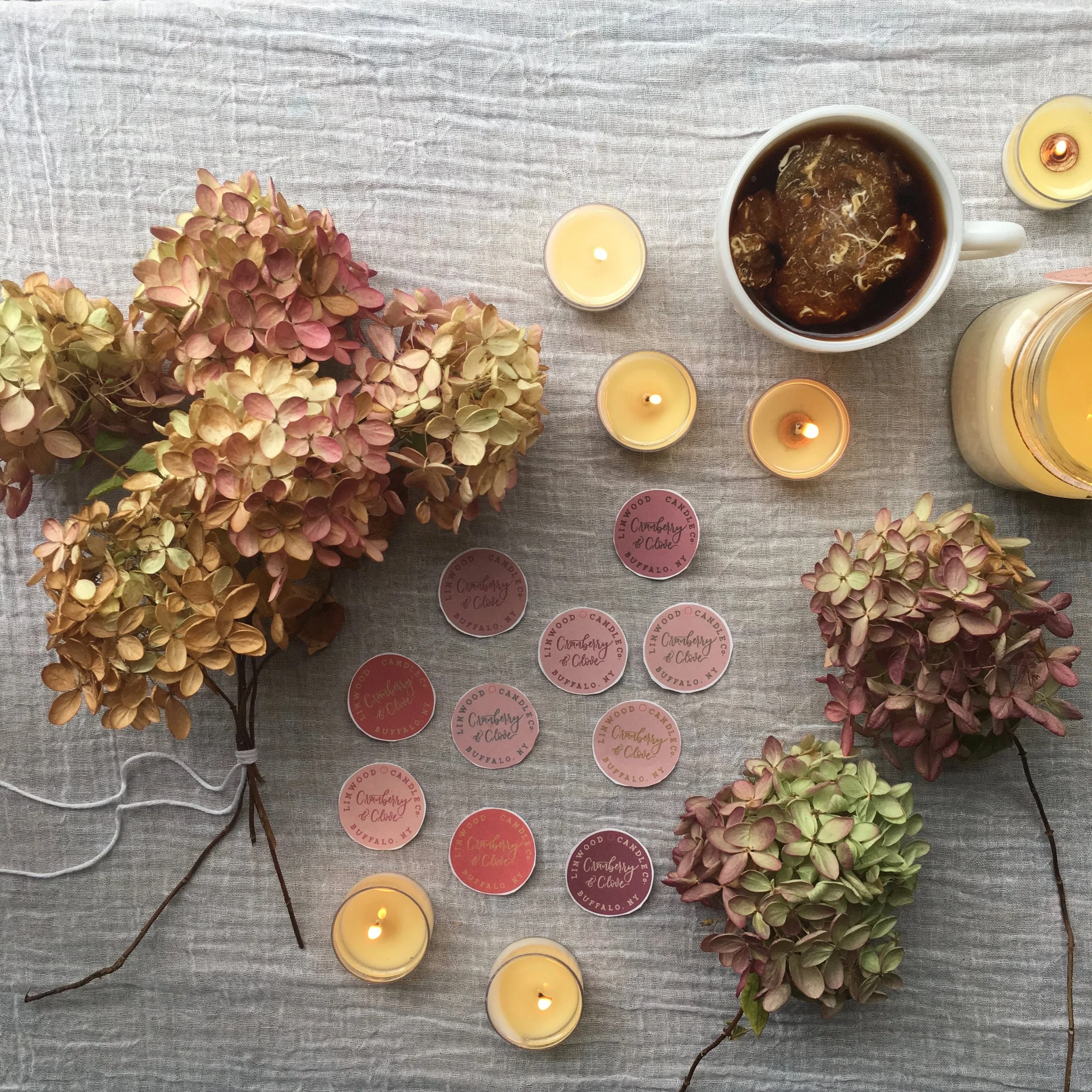
I took an Adobe Illustrator course at Flower City Arts Center. It's a space in Rochester, NY specifically for makers, designers & creators. After taking the course I plunged into a branding update for our hang tags. I've been wanting to do this for months. I'm so pleased with the way the colors turned out. I chose a unique color for each scent.
These images capture one scent: Cranberry & Clove and the different color options that I created for it. I did this for each scent: 12 total. Honestly, once I started this project the creativity was flowing. I loved creating a cohesive color palette that reflects our branding.
Soft blush, muted tones, botanical elements...
My good friend Jess created the beautiful calligraphy and I translated it into illustrator.


